
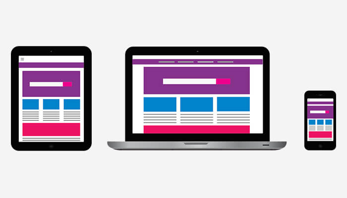
Responsive web design is one of the major aspects of Web design. If you are a designer you might have heard about it, even realized its importance in current scenario. Responsive web design websites dominate World wide web for several good reasons.
The ultimate goal of responsive web designs is for content to render differently depending on the size of device. So, user doesn’t have to resize anything to view the content. Which in turn, helps visitors to have an optimal experience no matter on which device they access your website.
Audi.com was the first was the world’s first website that was designed to adapt its layout according to the width of the browser’s viewport. Terms such as ‘fluid’, ‘liquid’, ‘elastic’, and ‘flexible’ were used before to describe the concept.
In 2010, Ethan Marcotte a designer comes up with the phrase “Responsive web design”. Later in 2011, he also wrote a book with title “Responsive Web Design”.
A responsive Website design benefits designers, developers, businesses, and most importantly the users of website. Investing in a responsive web design can be highly beneficial, we are going to discuss that below.

According to a report by SimilarWeb around 56% of total traffic on websites comes through mobile and smartphones. Therefore, it becomes extremely important for businesses to emphasize on a web design that supports screens of any size.
Ignoring this important aspect can result in losing large number of potential customers, eventually leads to loss in business.
Before businesses used to make two different websites for both desktop and mobile versions. Many businesses still do that. Looking at the current scenario and explosion of devices like tablets and mobile it sounds pretty illogical to have two different versions of same website.
Making a single website that fits perfectly on any device regardless of their size takes considerably lesser time.
Even if the initial investment in making responsive website turns out to be costlier, it helps you big time in long run. Setting up a single website is relatively easy. Moreover, maintenance cost, special configuration costs, and other expenses can be saved using a single version.
Developing a website isn’t enough it requires additional testing and support time to time. Having separate websites for different versions would require different strategies, different interfaces, and most probably different designing teams too.
Following “one size fits all” approach you can spare time for your developing, designing, and testing team. Making marketing strategies, content creation, and other activities can be done in spared time.
Studies have proved mobile users have a shorter attention span. If your website won’t load completely in 3 seconds, it can frustrate users to a point of no return. Therefore, it becomes highly important for your website to be optimized for smartphones, tablets, and other devices.
By using modern performance techniques like caching and responsive image display will improve the loading time of your website.
A responsive website provides seamless experience to your users and keeps them engaging. Therefore, it is likely that they gonna stick around and spend more time exploring different areas of your website.
In contrast, if your Website isn’t responsive it will confuse and frustrate the users. They won’t find it engaging and eventually leave your website.
To make informed decisions about the business it’s necessary to have deep insights about it. Knowing where traffic is coming from and how the user interacted with your website can help your business grow evidently. Problem arises when you don’t have a single responsive website for all the devices.
It becomes hard to keep track of the user’s journey through multiple funnels, redirects, and conversion paths. Therefore, it is highly recommended to have a single website for simplifying monitoring efforts across every device.
Google Analytics is an ultimate tool that assists you in providing analytics reports. You can keep a check on how your content is performing across every device.
Search engine optimization or SEO is important for every website so that they can get a higher ranking in google search results. And, according to the latest update by Google, it has started giving preference to websites that are mobile-friendly.
Now, having a responsive website design is as important as having stronger back links and better bounce rates. Furthermore, having two different versions of the same website creates an issue of duplicate content that can impact negatively on your Google search ranking.
It’s high time that everyone should take responsive website design seriously. It became an important part of every modern web strategy. High chances of your competitor adapting to this change are pretty likely and that can cause your business to suffer.
Moreover, it helps you to save various expenses, time, and also helps to convert and retain more clients. It’s no brainer that you should definitely go for Responsive web design for your business website.
If you are interested and want some expert advice on website redesign you can contact us. we would be more than happy to assist you.

